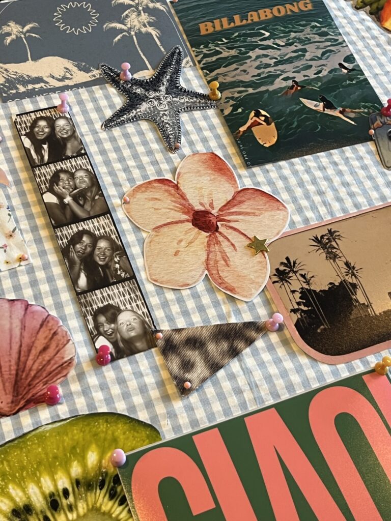
There’s no one-size-fits-all brand — and honestly, thank goodness. The best visual identities are the ones that feel natural, honest, and unmistakably you. They don’t rely on trends or Pinterest templates. They come from clarity, intention, and a little bit of creative bravery. But getting to that place? It takes more than picking a cute font and calling it a day.
If you’re building a brand (or reimagining one), here’s a simple guide to help you craft a visual identity that aligns with who you are — not just what you do.

1. Start with brand clarity.
Before you touch a color swatch or scroll through font options, pause. Ask yourself: What do I want people to feel when they interact with my brand? Confident? Calm? Inspired? Seen?
Those feelings should drive every design choice that follows. Because your brand isn’t just what it looks like — it’s what it makes people feel. So get clear on your mission, values, and vibe before you touch the visuals.
2. Define your brand personality.
Your brand has a personality — even if you haven’t officially named it yet. Start by asking: If my brand were a person, how would it speak?
Is it witty and bold? Gentle and intentional? Minimal and luxe? The tone of your voice impacts how your design should look. Your visuals and your copywriting should feel like they’re having the same conversation.
Pro tip: Think of 3-5 adjectives that describe your brand. Use them to filter every visual choice.
3. Choose a color palette that aligns.
Colors carry weight. A moody green says something different than a buttery beige. When picking your brand colors, keep your personality and emotional goals in mind. Choose 3–5 core shades that can work together across different platforms.
Need help? Tools like Coolors or Adobe Color can help you explore palettes. Start with one color you love, then build around it.
4. Pick your fonts wisely.
Typography matters more than people realize. It sets the tone before anyone reads a single word.
Are you classic and refined (hello, serif fonts)? Clean and modern (sans-serif all day)? Quirky and bold (bring on the fun display type)? Choose one or two fonts that feel aligned with your brand voice — and commit to them. Consistency builds recognition.
5. Create a visual moodboard.
Sometimes it’s easier to see your brand before you fully define it. Collect logos, textures, photos, packaging, even architecture — anything that gives off the vibe you’re going for.
Use Pinterest, Canva, or Figma to pull everything together in one place. When you look at it as a whole, you’ll start to notice patterns in your taste — those are clues pointing toward your visual identity.
6. Test it in the wild.
A brand can look great on paper but fall flat in real life. Mock up your logo, colors, and fonts on real applications: Instagram posts, your website homepage, business cards, a pitch deck. How does it feel? Is it communicating what you want it to?
Be willing to tweak. Refinement is part of the process.
Final Thoughts
Your visual identity should grow with you — it doesn’t have to be perfect or permanent. But it should feel true. When your brand looks and sounds like you, it resonates more deeply. It builds trust, creates consistency, and makes showing up online feel natural instead of forced.
Start with intention. Stay curious. And remember: your brand isn’t a costume — it’s a reflection.